Overview
NPD Group is a Market Research company, measuring shopping trends and consumer receipts to understand and predict shopping trends. In 2013, Small Planet created ReceiptPal, an app that lets users earn rewards by submitting receipts from recent purchases. The receipts, once validated, can be redeemed for cash prizes, gift cards, and other similar rewards.
Problem
The ask from the client was to redesign the incentive program in order to grow the user base and improve app engagement, while minimizing existing user drop-off, and maintaining budget costs for the user group.
Solution
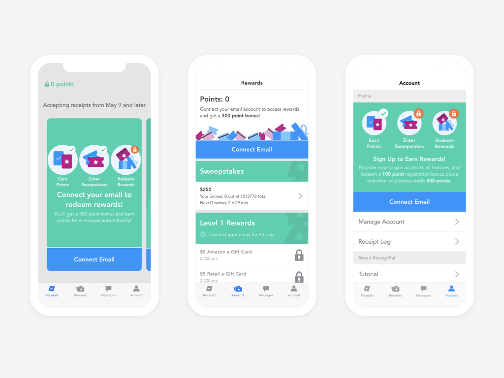
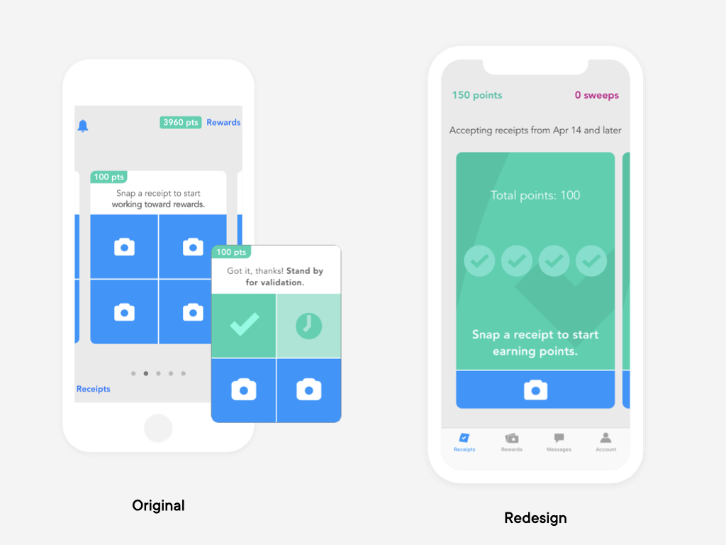
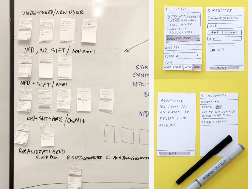
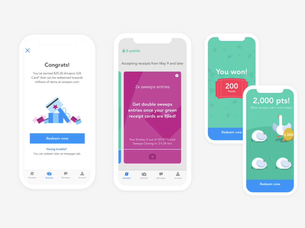
We proposed a re-skin: modernizing the UI with consolidated navigation, adding mini games to drive engagement, enhancing the sweepstakes experience, and updating the rewards. In addition to this, we worked on a marketing campaign and partnered with couponing blogs to generate more interest.
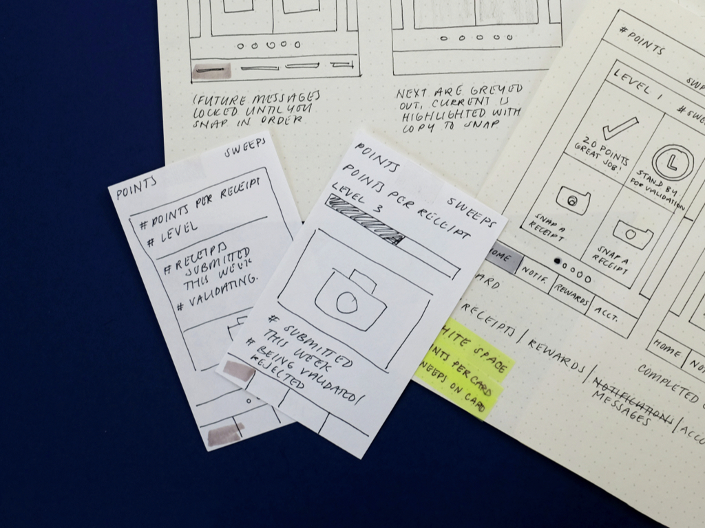
The home page got a huge facelift and was designed with the intent to integrate a levels system to build excitement and increase engagement in the app. A tab bar was also added for easier navigation.
We created a new economy system for points and reward redemption to make room for the addition of mini-games. Lastly, we created marketing assets for an incentives program to recruit new users. For this portion of the project, I created the marketing campaign animation.
User testing
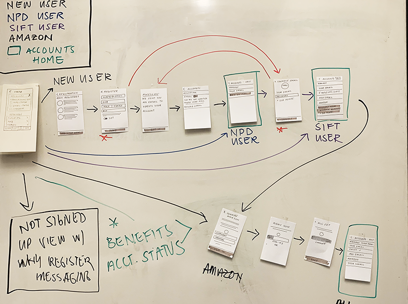
After the introduction of our new points economy, I wrote scripts and conducted usertesting to gain a better understanding of what was working with our update. Our userbase was a loyal one, and with a big UI change it was important not to lose anyone. The feedback overall was positive— that the app was easier to use, the minigames were engaging and brought them into the app more, and the tiered economy incentivized users to sign up and connect multiple accounts, hitting one of the primary asks from NPD Group.
The marketing video I made.
Outcome
The outcome was ~96% increase in App store ratings (from 2.4 to 4.7), and the release trended in Google Play’s Shopping category. We also surpassed our goal of recruiting 60,000 downloads, and completed the project under budget. Within just a few weeks after launch, it reached 2.2 million views on Facebook and 160,080 views on YouTube. The app is available in the App Store and Google Play Store.
